
Most people who respond to a Rallly poll do it from their phone, often within minutes of receiving the invite link. That moment is the heart of the product, so when we hear that it causes confusion, we listen.
And we did hear it. Some of you told us that the old voting interface wasn't obvious enough. The small "?" button next to each time was easy to miss, and a few participants pressed Continue expecting to choose their times on the next page, only to find they had accidentally answered "no" to everything.
Today's update rebuilds that experience from the ground up.
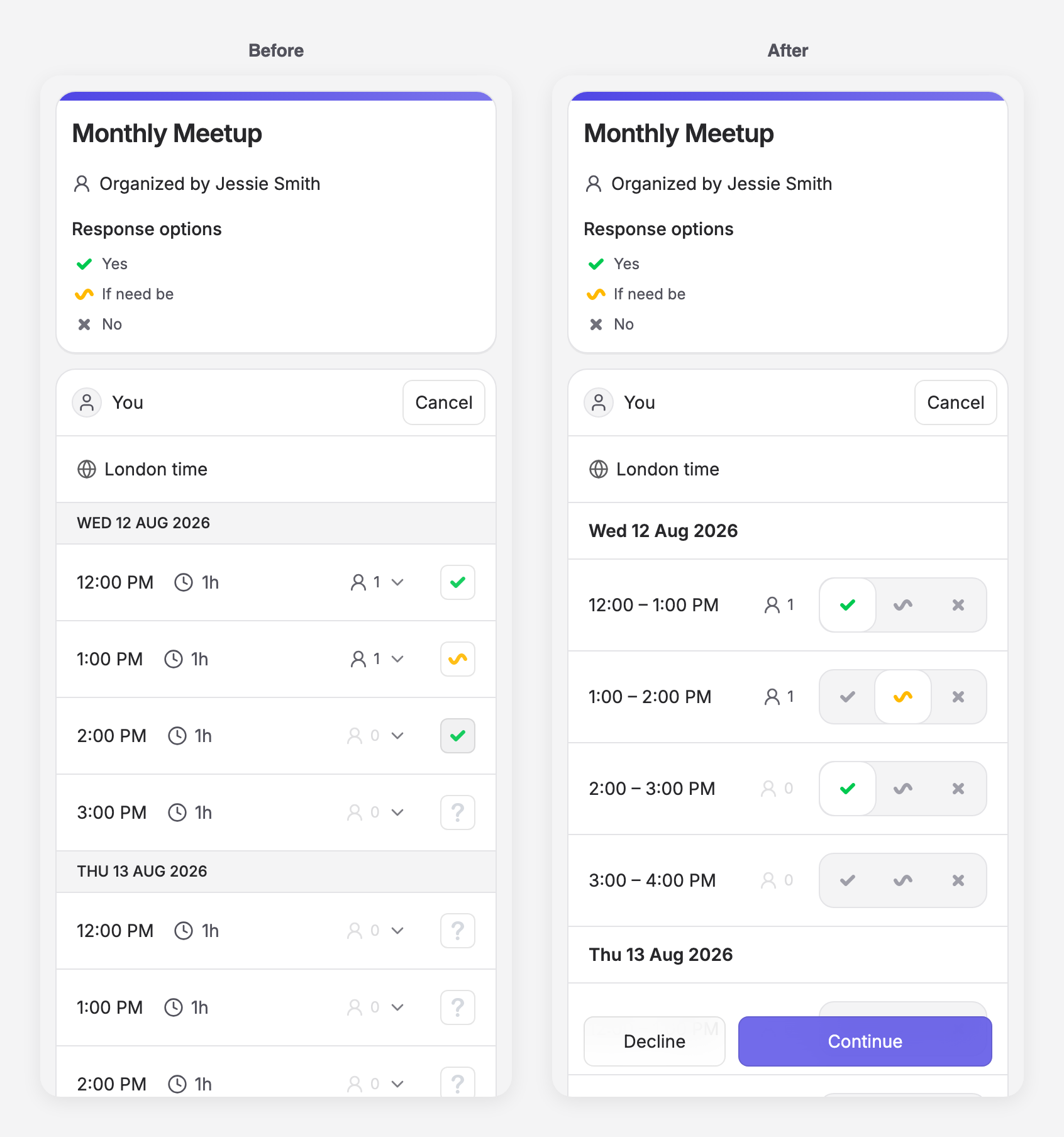
See all your choices
Every time slot now shows all three responses as a single selector: Yes, If need be, and No. There's nothing to discover and no hidden states. You tap the answer you mean, and it lights up.
Times you can read
Options now show the full time range, like "12:00 – 1:00 PM", instead of a start time with a separate duration. What you're voting on is the range itself, so that's what you see.
Harder to answer by accident
Continue stays inactive until you've selected at least one option, and if none of the times work for you, there's now an explicit Decline button. Both float within reach at the bottom of the screen while you scroll, so you're never hunting for them on a long poll. Submitting an empty response by accident is no longer possible.
Built for thumbs
The new controls meet Apple's recommended touch target sizes, and we removed the tap delay so every press gets instant feedback. Voting on a poll with 20 options should feel quick rather than fiddly.
Nothing about your existing polls or responses has changed. This is purely a better way to do the same thing.
As always, if something feels off or you have an idea to make voting even smoother, let us know. This update started with feedback from users like you.